Australian Public Service Commission Learning Centre map
-

The problem.
When the Australian Public Service Commission moved to it’s a new location it was soon noticed that people were having difficulty finding our Learning Centre.
I was asked to come up with a solution.
-

The solution.
I performed some user research - getting permission to hand out a questionnaire to Learning Centre visitors. This research fed into information gathered from other sources, and the end product was a map! Not just any old map though. Google maps integration for GPS. Isometric illustration. Clear, concise, functional and packed full of useful information such as bus routes, parking details, ATMs and places to eat.
-

The feedback.
Three months after the map had been incorporated into the Learning Centre’s website the same questionnaire was used.
All the feedback was positive.
One person even went as far as to say ‘It is the best map I have ever used.’
Digital Summit 2020
-

The brief.
The DTA were engaged to run a Digital Summit for the APS and private sector - bringing together a host of industry experts, experienced practitioners and thought leaders to deliver an international online event.
A new bright, bold, brand was needed that would establish the event not only as a place where information was being delivered but as an open forum where information and two-way dialogue could continue after the event was closed.
-

The concepts.
A number of concepts were delivered to the CEO and Executive Board who were unanimous in choosing a design.
The chosen design was simple and bold and was evocative of the nature of the event - opening and maintaining a dialogue and the sharing of information.
-

The event.
Once approved, the design was implemented across a wide range of digital and physical media, from mobile apps, video graphics, social media and invitations to pull up banners, programs and a prospectus.
Overall the event and brand was a great success with higher than expected virtual attendance numbers and positive feedback throughout.
Digital Transformation Strategy:
Year One update
-

The brief.
The Digital Transformation Strategy set the direction for the work of the DTA to 2025. The Roadmap describes a rolling two-year window of work that was planned.
The DTA needed an update to the first year of the strategy to inform on it’s progress.
-

The design.
The heart of the brief was to make something in the DTA style yet different - it needed to have the look of something progressing, not something that was static.
-

The product.
The final piece was simultaneously released as a printed booklet and as an accessible pdf. Was well received by the CEO of the DTA and the current Minister.
Notify.gov.au
a video in 6 hours
On a quiet friday morning I was approached by an area lead that informed me a video was needed that described how out new Notify app worked. The CEO needed the video by 4pm that day to show at a talk he was giving.
The first step in the process was to get a storyboard approved and then get assistance to write a script. Once these had both been approved - with the understanding that approval meant no more changes - I recorded a colleague reading through the script. Once this had been edited and approved it was then a matter of filming bespoke scenes and utilising previously shot stock footage to compliment the spoken word. In the end around 80% of the video was recorded for the project with he rest coming from other sources.
The final product delivered within the 6 hours was very well received and was used throughout the life of the product.
A selection of other design work.
-

Australian Public Service Commission (APSC) - brand redesign and style guide creation
With a change of Commissioner came a request to privide the agency with a contemporary brand that would complement the APSC in it’s promoting of high standards of accountability, effectiveness and performance of the APS .
A number of brand concepts were presented with the chosen design being used for many years.
-

APSwide concepts
A bold design created to be eyecatching and immediate. Created using my own photography.
-

Rush! book - National Museum of Australia
A design and type layout for a National Museum of Australia publication on their gold and silver collection.
-

APSjobs logo
-

Recruitability logo
-

Diversity Awards logo
-

APSC LGBTI+ network logo
-

DTA logo concept
One of a number of logo concepts for a new DTA brand.
-

Cloud Assessment Tool - CAT - logo
The Cloud Assessment Tool needed a logo. The acronym was too good to pass up…
-

Balancing the Future
Design and typeset of one part of a three part report set published by the APSC.
-

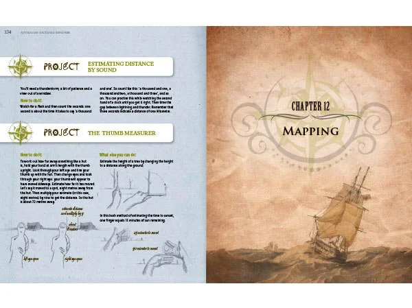
Australian Backyard Explorers - an award winning childrens book
A freelance piece of work for the National Library of Australia.
I designed, illustrated and typset this book that won that years Eve Pownall Award for Australian Children’s Information Books.
-

Quest for Paradise - National Library of Australia publication
Design and typset of NLA book on the Paradise Parrot.